Cyclone HQ
These are the latest updates to CycloneHQ.com
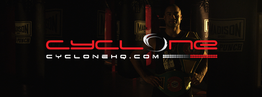
- The way the site is displayed on social networks.
- The header logo on the site has been changed to include “Boxing” and “Specialist fighter style fitness and psychology”.
- The navigation bar is now red rather than grey and the text hover colour is white.
- The “social share buttons” have been fixed throughout the site so now they display correctly in a line rather that a messy list.
- The header and body backgrounds have been changed to black and white.
- In the Latest News on the home page the way the text is displayed with the thumbnail has been corrected.


